Hospital Wayfinding Design: How to Help Patients Find Care with Less Confusion
Short answer
Effective hospital wayfinding is a coordinated system of clear destination names, understandable routes, signs placed at decision points, landmarks, maps, digital guidance and trained human assistance. It should help a first-time visitor reach care without needing to interpret the hospital's internal organisation.
Key takeaways
- Use one public-facing name for each destination across appointment messages, the website, kiosks and physical signs.
- Map journeys from their true starting points, then walk them as a first-time visitor.
- Place directions before a turn or lift choice, and confirmation after complex transitions.
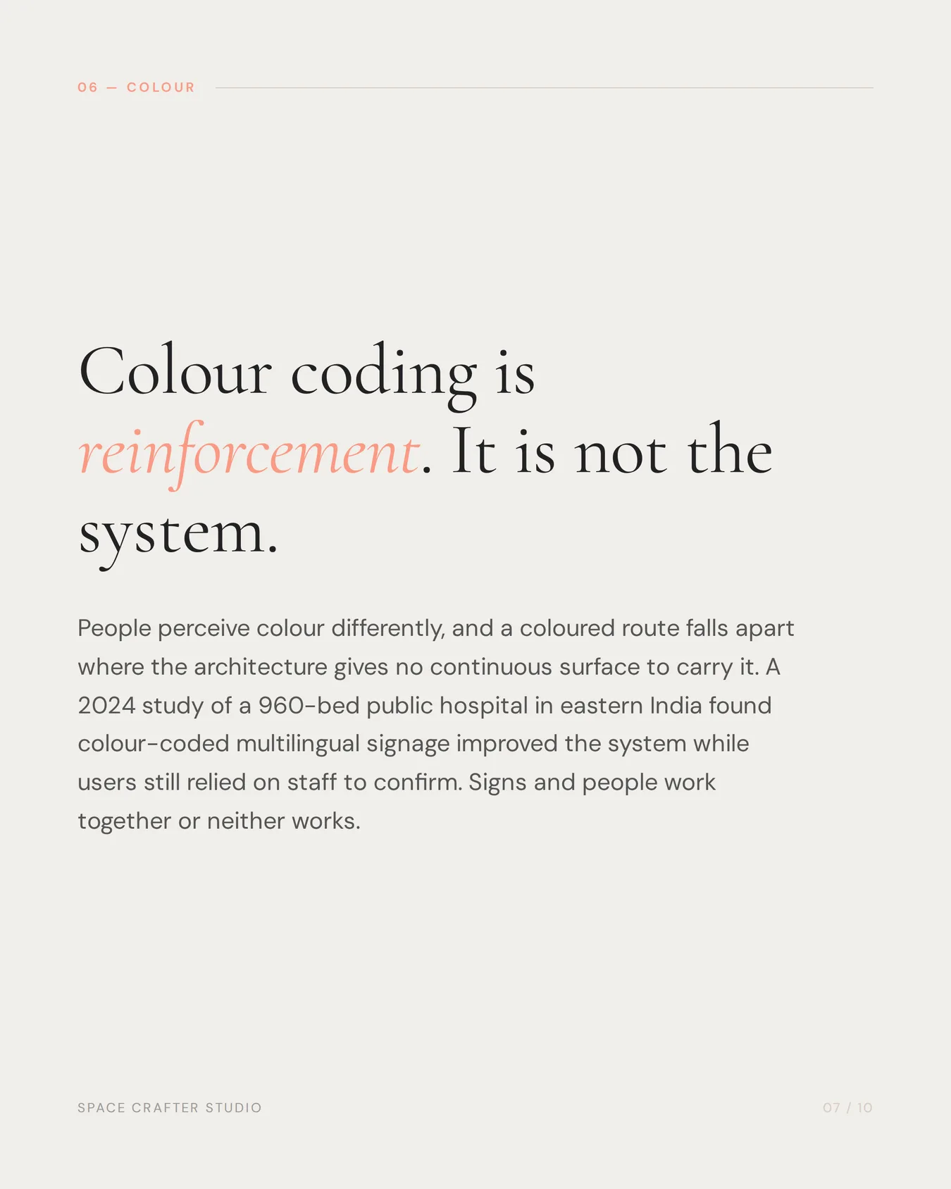
- Colour coding reinforces a system. Pair it with words, symbols, numbers or landmarks, and never carry critical information on colour alone.
- Test with representative users on realistic tasks, including older adults, wheelchair users and people using other languages.
Effective hospital wayfinding is a coordinated system of clear destination names, understandable routes, signs at decision points, landmarks, maps, digital guidance and trained human assistance. It should help a first-time visitor reach care without needing to interpret the hospital’s internal organisation.
The goal is not to put more signs in every corridor. It is to reduce the number of difficult decisions a patient or family member must make.
Why is hospital wayfinding unusually difficult?
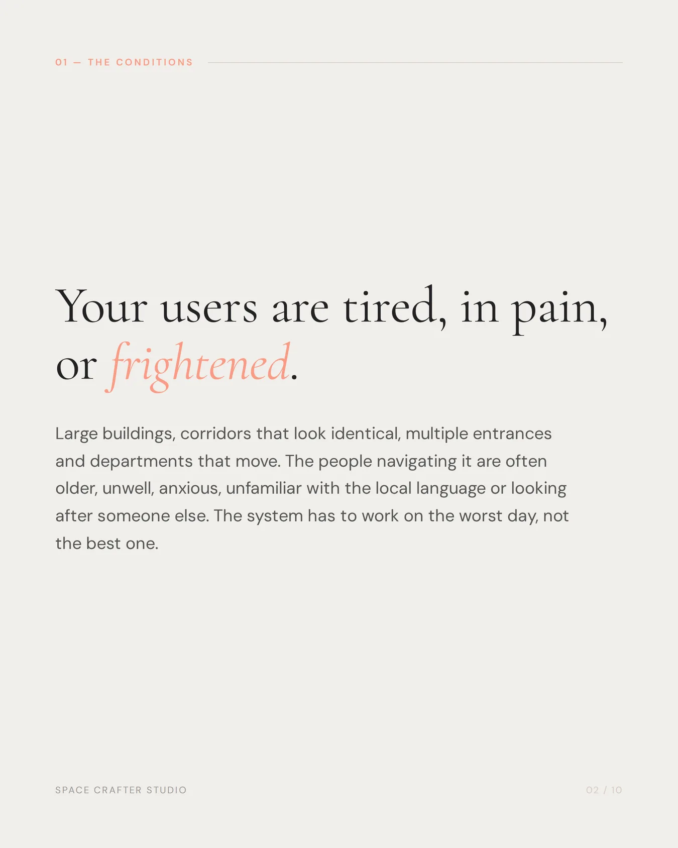
Hospitals combine large buildings, repeated-looking corridors, multiple entrances, changing departments and people under time pressure. Users may be older, tired, in pain, anxious, unfamiliar with the local language or assisting somebody else.
The environment also serves different journeys at once: emergency arrivals, outpatient appointments, inpatient visitors, diagnostics, staff, deliveries and accessible routes.
Research supports treating wayfinding as an operational issue. A 2024 quality-improvement study of a 960-bed public hospital in eastern India found that colour-coded multilingual signage improved the system, while users still relied on staff confirmation—evidence that signs and human support must work together. The study is available through the US National Library of Medicine.
Start with patient journeys, not a sign count
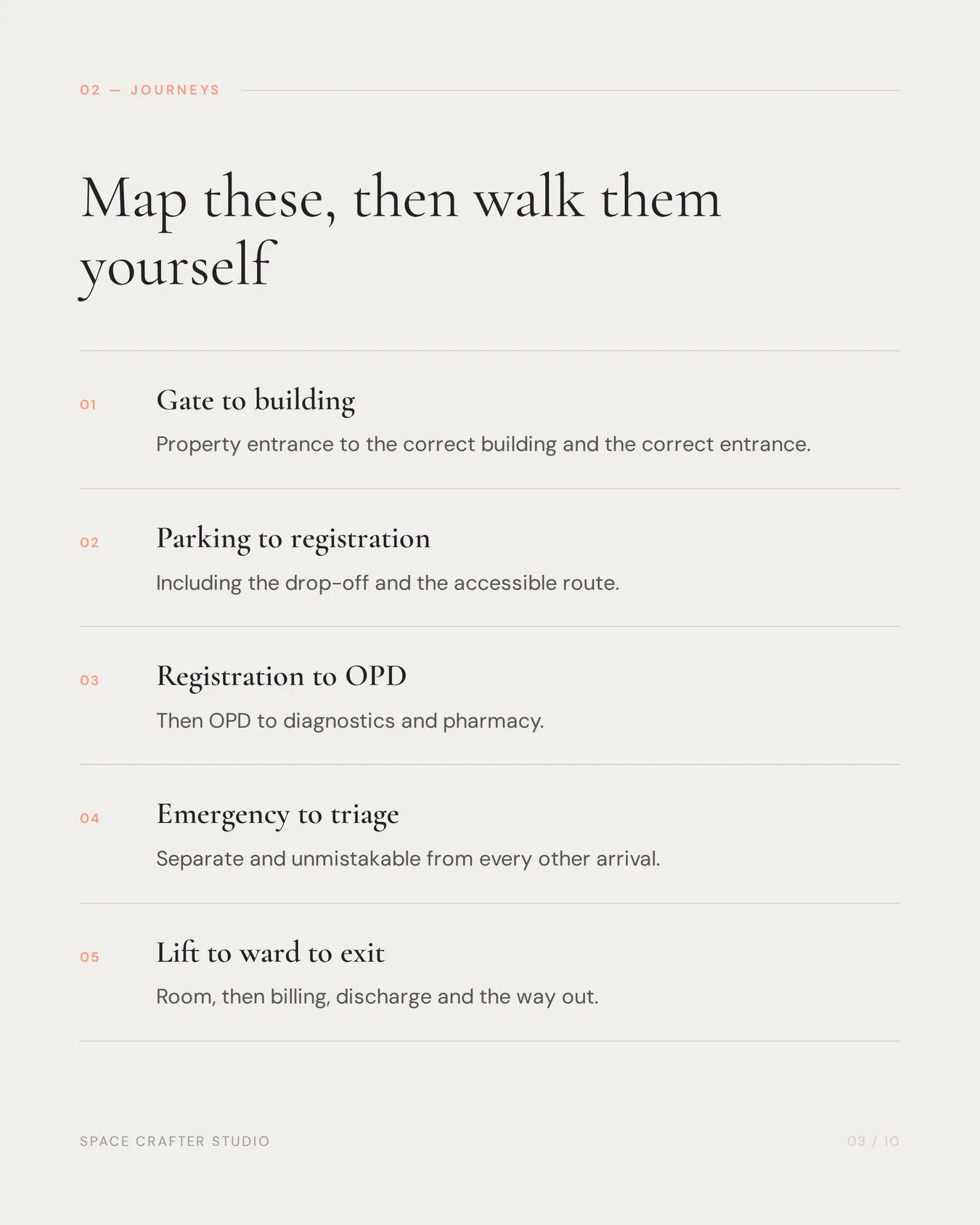
Map common journeys from their true starting points:
- property entrance to the correct building;
- parking or drop-off to registration;
- registration to outpatient department;
- outpatient department to diagnostics and pharmacy;
- emergency entrance to triage;
- lift or stair to ward and room;
- ward to billing, discharge or exit; and
- each destination through an accessible route.
Walk these paths as a first-time visitor. Record where a person must choose, where the destination disappears from view and where the route changes between outdoor, lobby, lift and corridor environments.
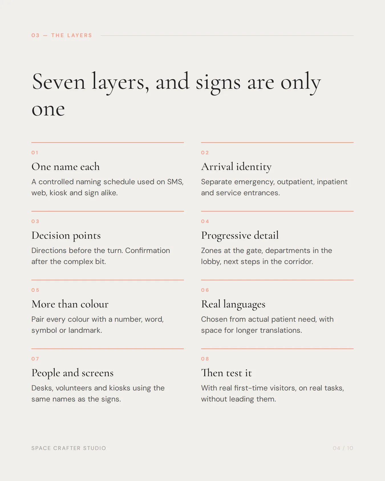
The seven layers of a hospital wayfinding system
1. Consistent destination names
Use one public-facing name for each place. If a booking message says “Imaging,” the entrance directory says “Radiology” and staff say “Diagnostics,” the building has created three destinations in the visitor’s mind.
Create a controlled naming schedule. Include approved abbreviations, local-language versions and rules for how names appear on appointment messages, websites, kiosks and physical signs.
2. Clear arrival and entrance identification
A visitor must identify the correct building and entrance before interior signs can help. Separate emergency, outpatient, inpatient, staff and service arrivals where the site requires it. Reinforce each with signs, lighting, canopy identity and drop-off information.
3. Information at decision points
Place directions before a turn, lift choice or corridor split. Add confirmation after complex transitions. Avoid filling straight routes with repetitive instructions while leaving a critical junction unmarked.
4. A simple information hierarchy
Show only what a person needs at that moment. A campus entrance may direct to buildings or zones. A lobby directory can list departments. A corridor sign should show the next destinations, not the hospital’s complete service catalogue.
5. More than colour alone
Colour can reinforce floors or zones, but pair it with words, symbols, numbers or memorable landmarks. Users perceive colour differently, and a coloured route can be hard to follow when the architecture lacks continuous cues.
6. Multilingual and accessible communication
Choose languages from actual patient needs. Keep translations consistent and give each language sufficient space. Review typography, contrast, mounting height, tactile information and symbols against current accessibility requirements for the project.
7. Human and digital support
Reception desks, volunteers, appointment messages, digital maps and kiosks should use the same naming system as the signs. Digital guidance should supplement a robust physical system, not rescue an incoherent one.
What signs does a hospital normally need?
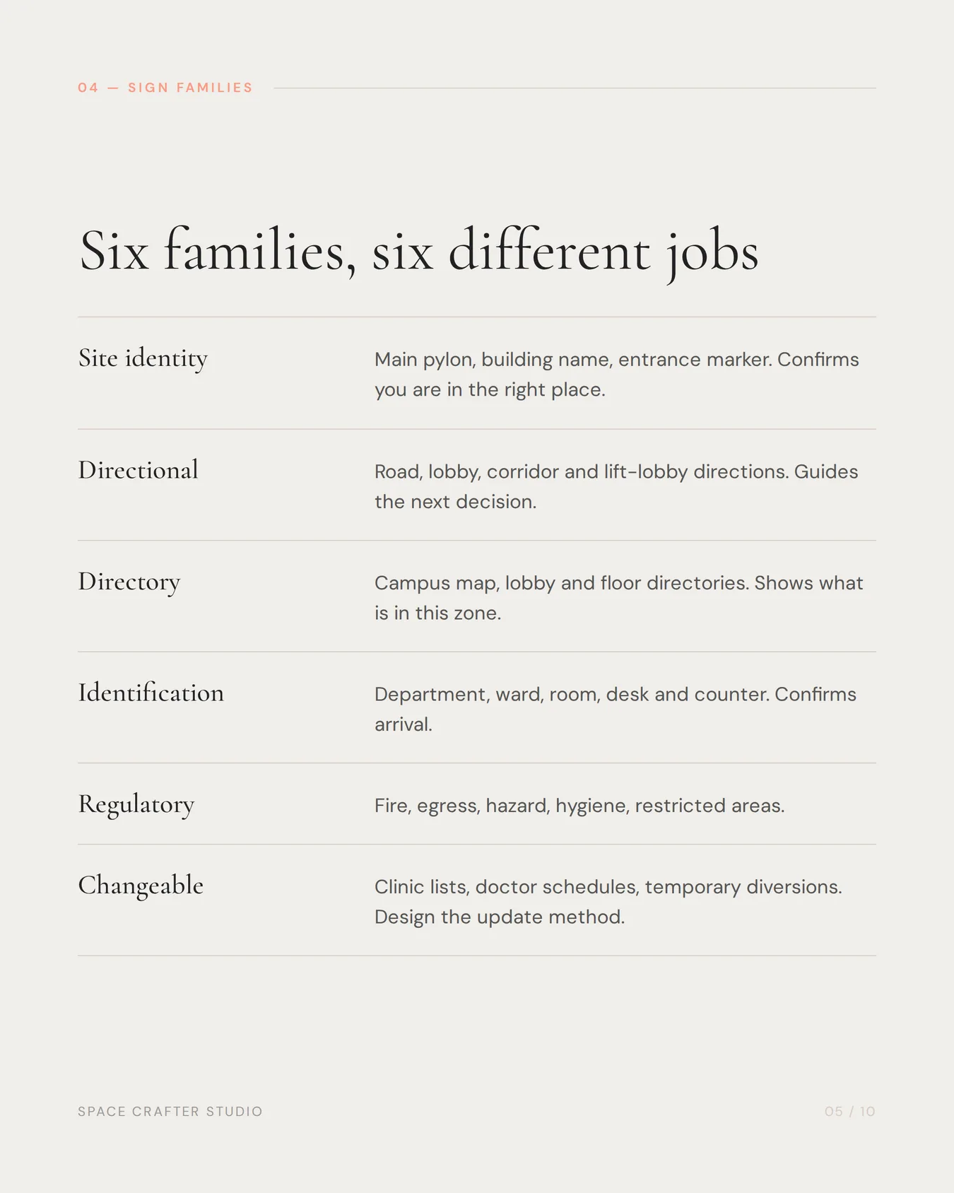
| Sign family | Purpose | Examples |
|---|---|---|
| Site identity | Confirm property or building | Main pylon, building name, entrance marker |
| Directional | Guide the next decision | Road, lobby, corridor and lift-lobby directions |
| Directory | Show destinations within a zone | Campus map, lobby directory, floor directory |
| Identification | Confirm arrival | Department, ward, room, desk and counter signs |
| Regulatory and safety | Communicate rules and emergencies | Fire, egress, hazard, hygiene and restricted-area signs |
| Changeable information | Accommodate operational changes | Clinic lists, doctor schedules and temporary diversions |
The sign family should feel consistent, but each type has a different reading distance, message load and maintenance need.
How should multilingual hospital signs be designed?
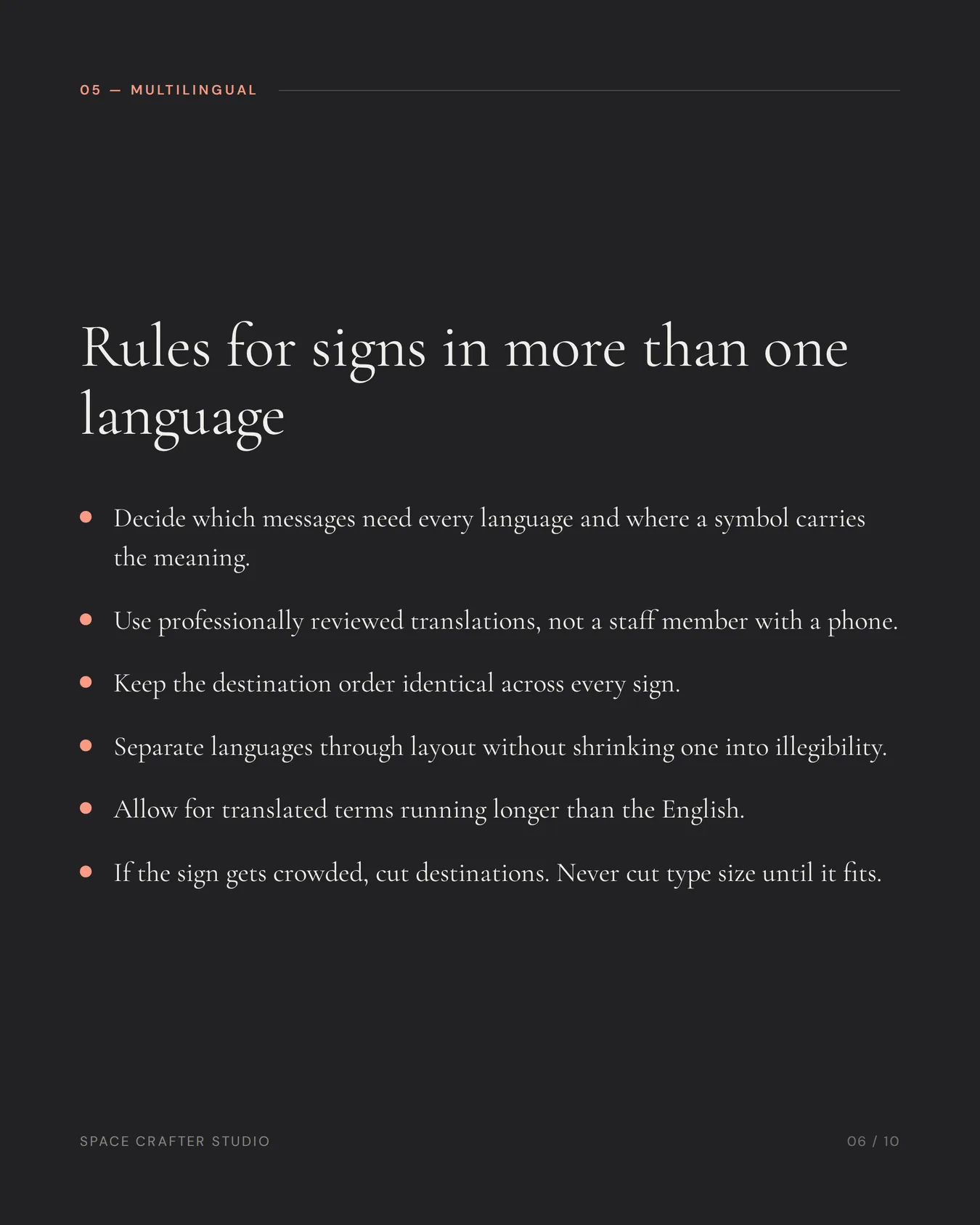
First decide which messages must appear in every language and where a universally recognised symbol can support comprehension. Then:
- use professionally reviewed translations;
- keep destination order consistent across signs;
- distinguish languages through layout without making one illegible;
- allow for longer translated terms;
- use arrows and symbols consistently; and
- test with real users, including people unfamiliar with hospital terminology.
Do not reduce text until all languages technically fit. If a sign becomes crowded, reduce the number of destinations shown or change the information architecture.
How do you test hospital wayfinding?
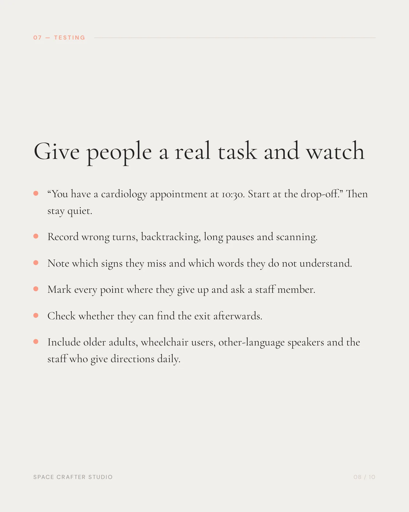
Give representative users realistic tasks, such as “You have an appointment in cardiology at 10:30—start at the car drop-off.” Do not lead them. Observe:
- wrong turns and backtracking;
- long pauses or scanning;
- signs they miss;
- terms they do not understand;
- points where they ask staff; and
- whether they can find the exit afterwards.
Include older adults, wheelchair users, people with low vision where appropriate, visitors who use different languages and staff who give directions daily. A 2022 study using virtual hospital environments found that combining environmental features such as landmarks and window views improved wayfinding performance; the abstract is indexed by PubMed.
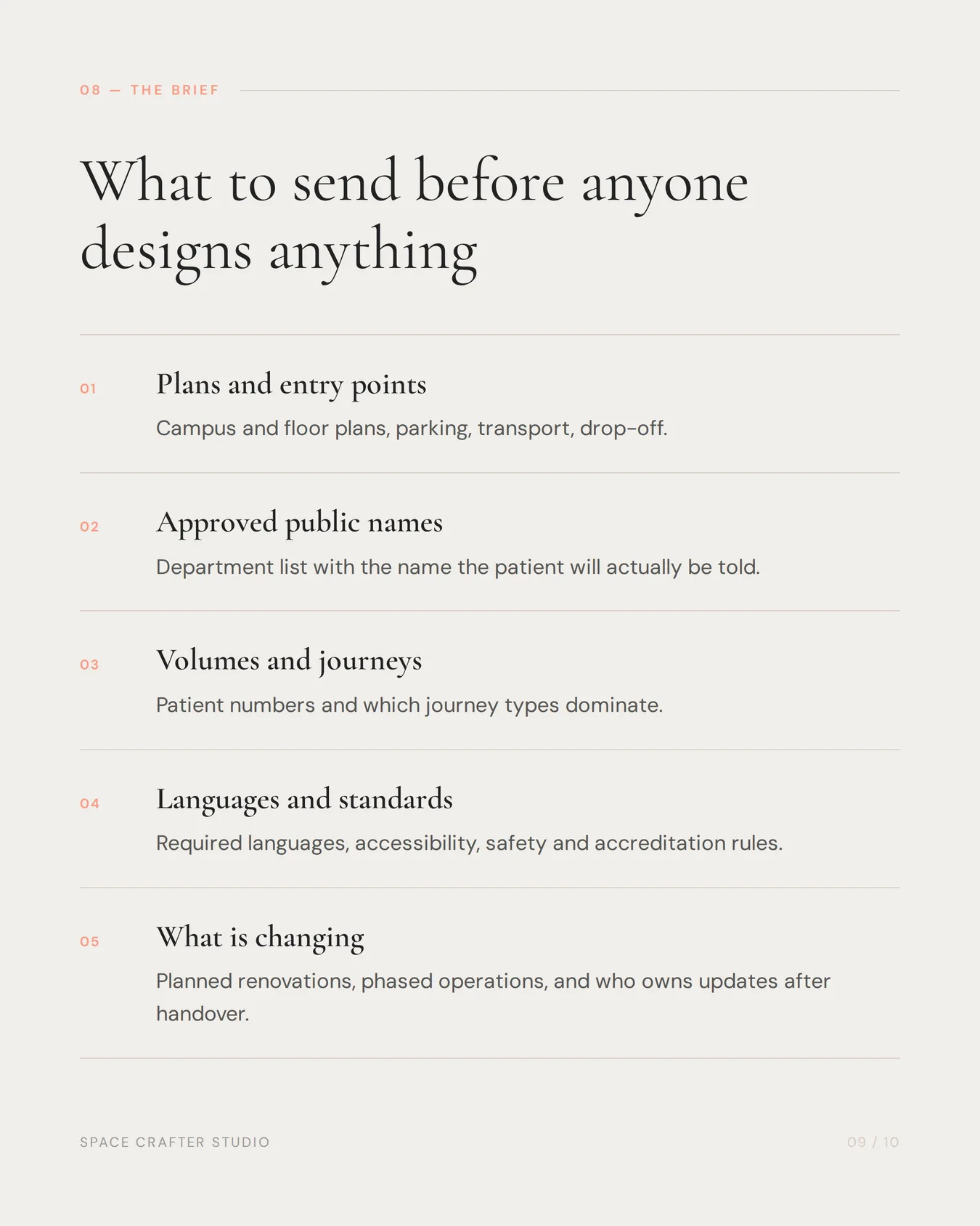
What should a hospital wayfinding brief include?
- campus and floor plans;
- entry, parking and transport information;
- department list and approved public names;
- patient volumes and major journey types;
- required languages;
- accessibility, safety and accreditation requirements;
- planned renovations and phased operations;
- existing complaints and staff observations; and
- responsibility for future content updates.
SpaceCrafter Studio plans, fabricates and installs healthcare signage and brand environments through one team. That integrated model helps keep the naming, drawings, materials and final placement connected from site survey to handover.
Last reviewed 2026-09-19 by the SpaceCrafter Studio Healthcare Wayfinding Team. Space Crafter Studio is a unit of Kingar Signs Private Limited, Bengaluru, designing, fabricating and installing signage, wayfinding, LED walls and brand environments since 1991.