Accessible Signage in India: A Practical Design and Procurement Checklist
Short answer
Accessible signage helps people with different visual, mobility, hearing, cognitive and language needs identify destinations, understand information and follow an accessible route. It combines clear wording, legible type, strong visual contrast, consistent symbols, appropriate mounting, tactile and Braille information where required, and placement that can be approached safely.
Key takeaways
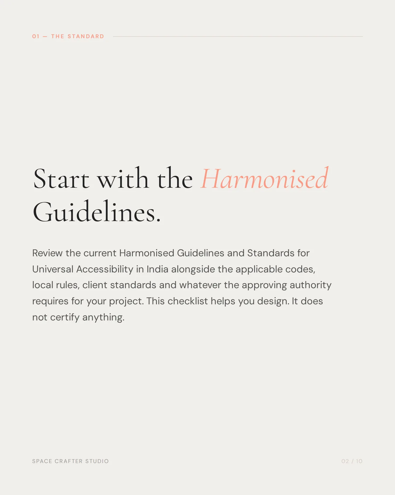
- Review the current Harmonised Guidelines and Standards for Universal Accessibility in India alongside applicable codes and the approving authority's requirements.
- Confirm a continuous accessible route exists before designing any sign for it.
- Never rely on colour alone. Pair every colour cue with a number, word or symbol.
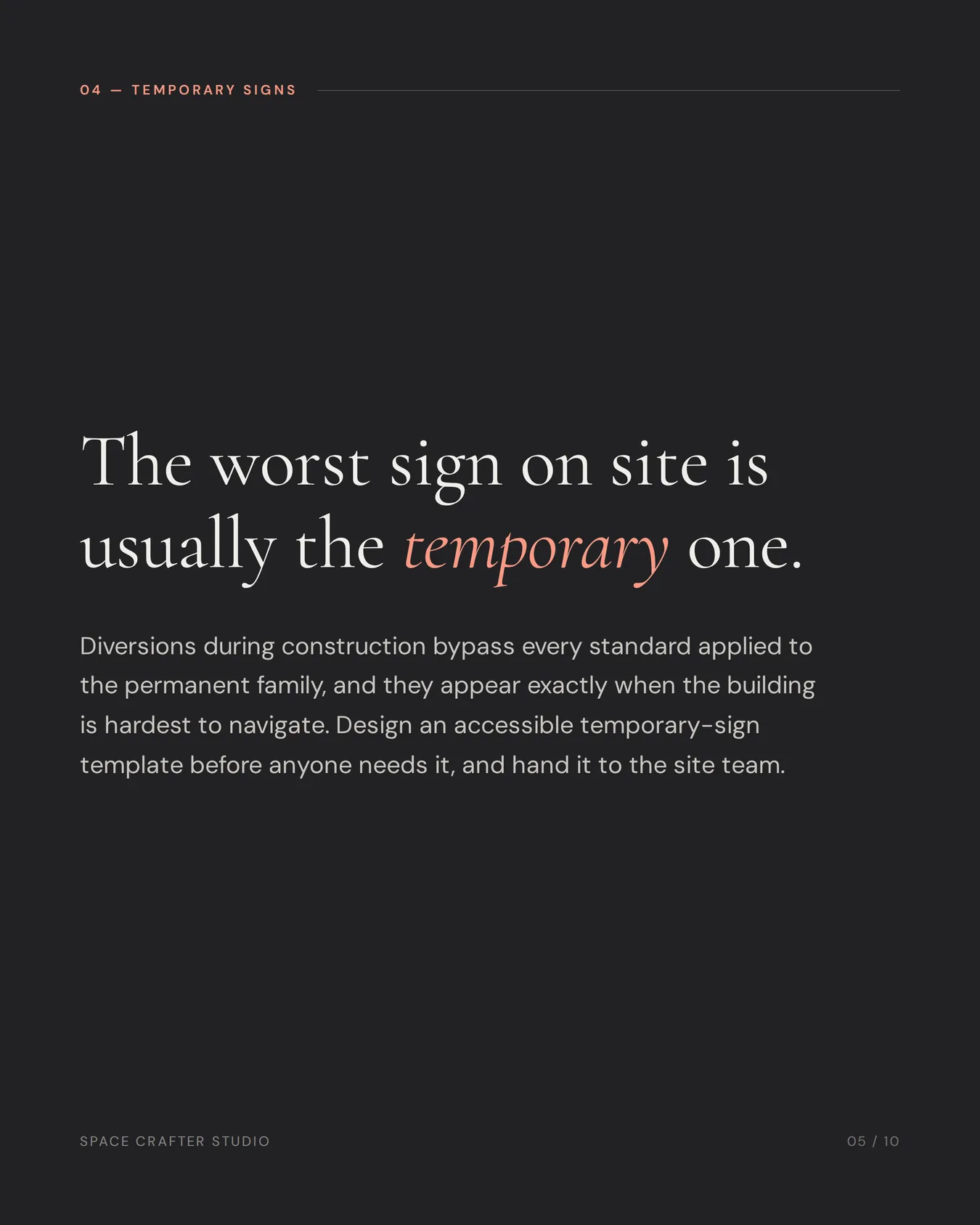
- Temporary and construction-diversion signs create the worst accessibility gaps. Design a compliant template in advance.
- Ask vendors to produce a compliant sample rather than a written confirmation of compliance.
Accessible signage helps people with different visual, mobility, hearing, cognitive and language needs identify destinations, understand information and follow an accessible route. It combines clear wording, legible type, strong visual contrast, consistent symbols, appropriate mounting, tactile and Braille information where required, and placement that can be approached safely.
In India, project teams should review the current Harmonised Guidelines and Standards for Universal Accessibility in India along with applicable codes, local rules, client standards and the requirements of the approving authority. The official 2021 guidelines are referenced by the Central Public Works Department. This article is a design checklist, not a compliance certificate.
Accessibility begins with the route
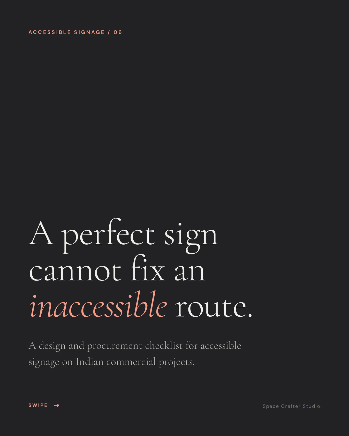
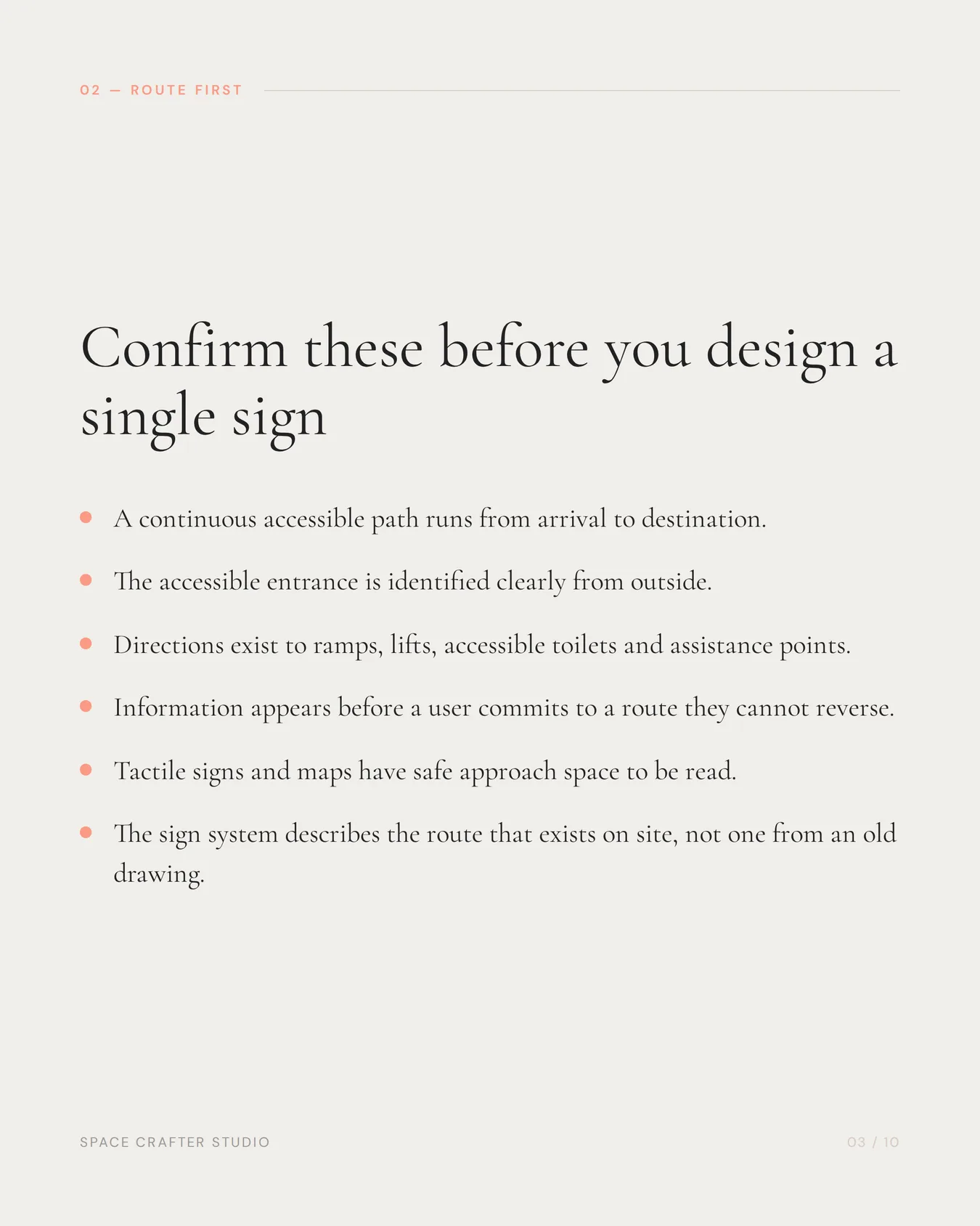
A perfectly fabricated sign cannot make an inaccessible route usable. First confirm:
- a continuous accessible path from arrival to destination;
- clear identification of accessible entrances;
- directions to ramps, lifts, accessible toilets and assistance points;
- information before a user commits to a route; and
- safe approach space where tactile signs or maps must be read.
The sign system should describe the same accessible route that exists on site—not an assumed route from an outdated drawing.
Accessible signage checklist
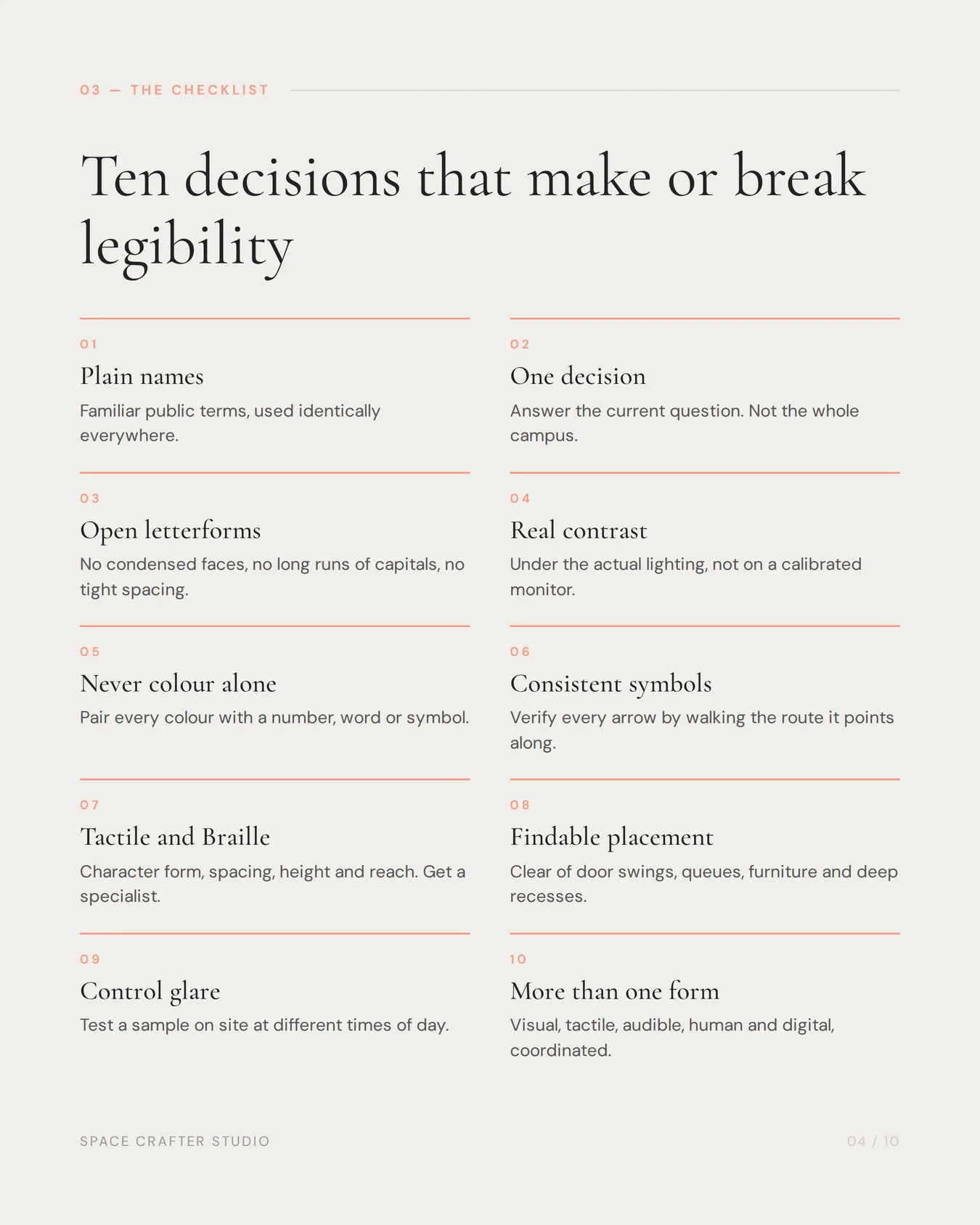
1. Use plain, consistent names
Choose familiar public terms and use them everywhere. Avoid switching between internal department names and visitor-facing names. Keep abbreviations to those the intended audience reliably understands.
2. Build a clear information hierarchy
A sign should answer the current decision. Group information, order destinations consistently and avoid presenting an entire campus directory at every junction.
3. Use legible typography
Choose typefaces with open, distinguishable letterforms. Size the type for actual reading distance and viewing conditions. Avoid condensed styles, excessive italics, long passages in capital letters and tight spacing.
4. Provide strong contrast
Text must stand apart from its background under real lighting, not just on a calibrated monitor. Reflections, shadows and transparent substrates can destroy apparent contrast.
Digital accessibility rules are not a substitute for built-environment standards, but the underlying visual principle is useful: the W3C explains that adequate light–dark contrast improves readability for people with low vision and that colour hue alone is not enough. Its guidance uses at least 4.5:1 for normal digital text and 3:1 for large digital text; see the W3C contrast explanation. Apply the legal and technical criteria required for the physical sign on your project.
5. Never rely on colour alone
If floors use different colours, add a floor number, word or symbol. If a route is called the “blue route,” use repeated text and directional confirmation as well as blue graphics.
6. Use consistent symbols and arrows
Symbols should be familiar, visually simple and used in the same way throughout the site. An arrow’s meaning depends on its placement and orientation; verify every direction by walking the route.
7. Coordinate tactile text and Braille where required
Tactile signs are not ordinary signs with raised decoration. Character form, Braille, spacing, mounting height, reach and clear approach matter. Engage a qualified accessibility professional and inspect production samples before bulk fabrication.
8. Place signs where people can find and read them
Avoid door swings, deep recesses, visual clutter and locations hidden by queues or furniture. Maintain consistent positions so users know where to look. Consider both standing and seated sightlines.
9. Control glare and illumination
High-gloss faces, glass reflections, uneven light and bright digital screens can reduce readability. Test a material sample in the actual environment at different times of day.
10. Provide information in more than one form
Complex environments may require a combination of visual signs, tactile information, audible announcements, staff assistance and digital tools. Redundancy is valuable when it is coordinated.
Which signs deserve early accessibility review?
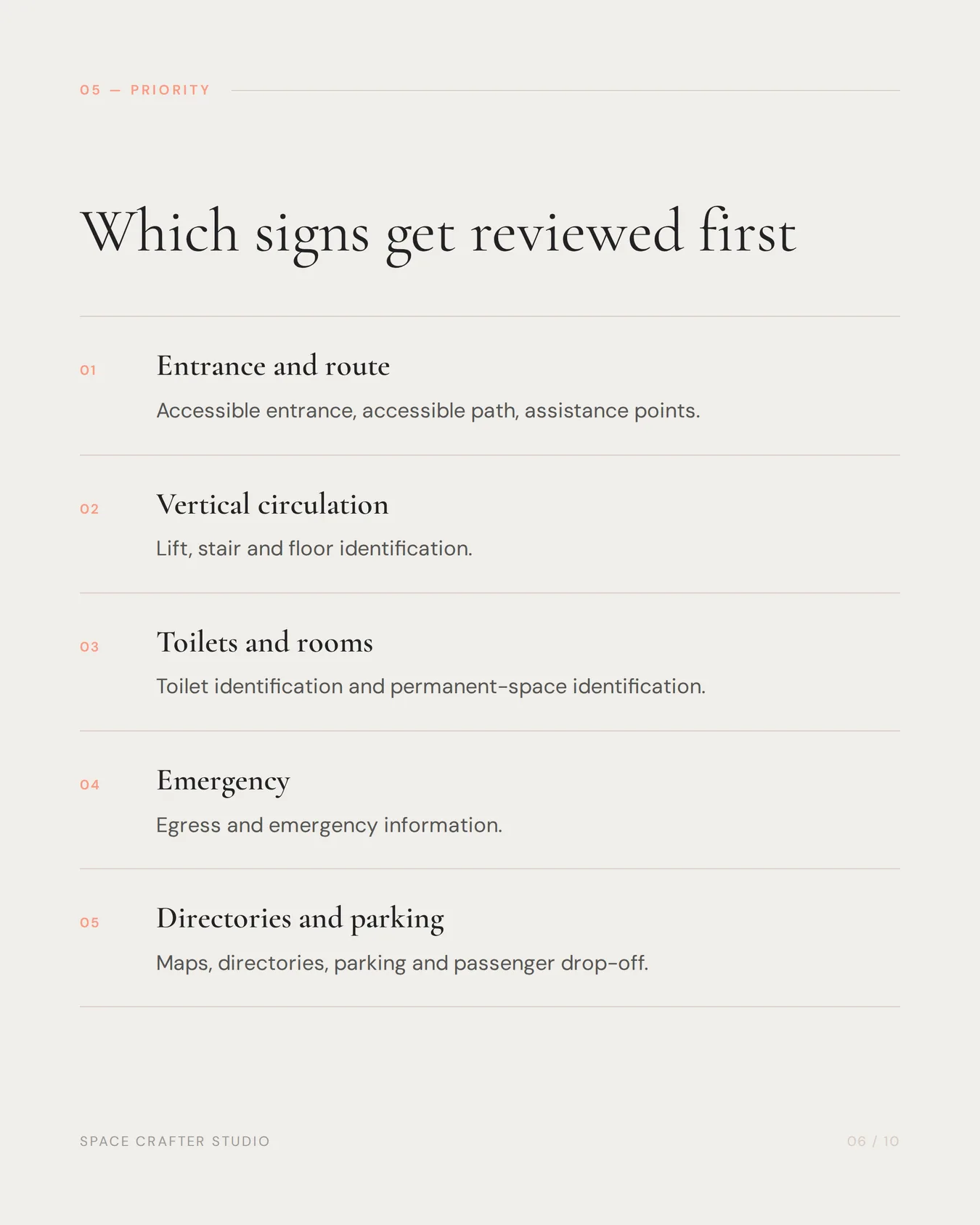
Prioritise:
- accessible entrance and route signs;
- lift, stair and floor identification;
- toilet identification;
- room and permanent-space identification;
- emergency and egress information;
- directories and maps;
- parking and passenger drop-off; and
- temporary diversions during construction.
Temporary signs frequently create the worst gap because they bypass the standards applied to the permanent family. Design an accessible temporary-sign template before it is needed.
What should an accessible signage specification contain?
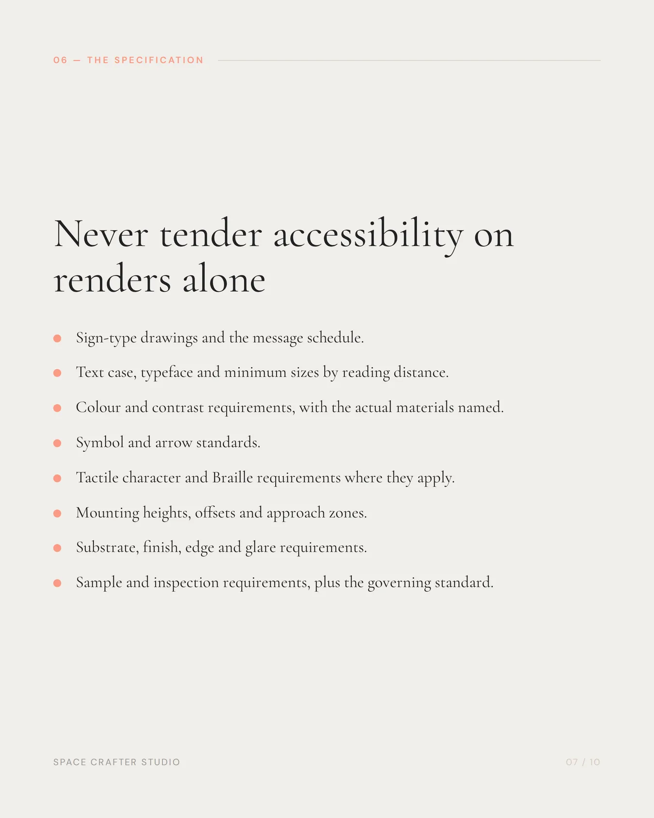
Do not issue a tender with only rendered visuals. Include:
- sign-type drawings and message schedule;
- text case, typeface and minimum sizes by reading distance;
- colour and contrast requirements;
- symbols and arrow standards;
- tactile character and Braille requirements where applicable;
- mounting heights, offsets and approach zones;
- substrate, finish, edge and glare requirements;
- illumination and electrical provisions;
- sample and inspection requirements; and
- the standards and approval process that govern the project.
The vendor should be able to produce a compliant sample, not merely confirm compliance in a sentence.
How should accessible signage be tested?
Review drawings, inspect samples and conduct a post-installation walk. Include people with disabilities and an accessibility specialist appropriate to the project.
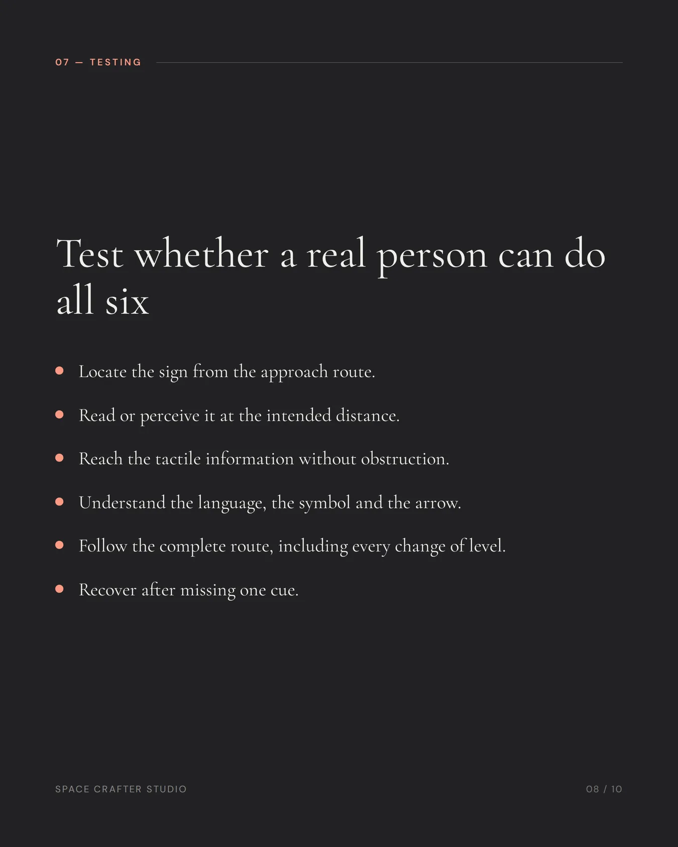
Test whether users can:
- locate the sign from the approach route;
- read or perceive it at the intended distance;
- reach tactile information without obstruction;
- understand the language, symbol and arrow;
- follow the complete route, including changes of level; and
- recover if they miss one cue.
Record defects by sign code and drawing location so corrections are auditable.
Accessible does not mean visually generic
Brand expression and accessibility are compatible. A system can use distinctive materials, patterns, landmarks and tone while protecting legibility, consistency and access. The constraint is useful: the identity must never obscure essential information.
SpaceCrafter Studio develops signage and wayfinding systems from survey and sign location plans through in-house fabrication and installation. For accessibility-critical projects, the design and sample approval process should include the client’s appointed compliance specialists and current project requirements.
Last reviewed 2026-09-19 by the SpaceCrafter Studio Wayfinding Team. Space Crafter Studio is a unit of Kingar Signs Private Limited, Bengaluru, designing, fabricating and installing signage, wayfinding, LED walls and brand environments since 1991.